Designing Accessible eLearning: ADA, Section 508, and WCAG
In this article, you’ll find out which laws and standards regulate matters regarding eLearning accessibility and the difference between them. We’ll provide you with tips and tools you might need to adapt your training to the special needs of your learners. Additionally, you’ll find some accessible eLearning examples.
Please note that this article is based on iSpring’s experience, and cannot be considered legal advice.
Many instructional designers are looking for information on how to make eLearning accessible for people with disabilities. A lot of education professionals find it a serious challenge.
One of the reasons to care about accessibility is the legal aspect. In many countries, in the US and the UK, for example, a lack of accessible eLearning content can be considered discriminatory against people with disabilities.
Another reason you should care about eLearning accessibility is the general user experience. Creating barrier-free learning means making it easy to use and easy to understand. In this way, the learning experience becomes better for everyone.
What Does Accessible eLearning Mean, and Why Is It Important?
Accessible eLearning ensures that digital educational content can be used by all individuals, including those with disabilities. This implies designing eLearning courses that accommodate various impairments, such as visual, auditory, motor, and cognitive disabilities.
Making eLearning courses accessible isn’t just about inclusivity—it’s also a legal and ethical obligation. Organizations that fail to meet accessibility guidelines risk legal repercussions and, more importantly, exclude a significant portion of learners.
By implementing digital accessibility best practices, institutions and companies can create accessible eLearning content and therefore:
- Expand their audience reach.
- Improve the learning experience for all users.
- Comply with legal accessibility standards like the ADA, Section 508, and WCAG.
What Are Accessibility Standards?
Several regulations and guidelines govern web accessibility. These frameworks ensure that eLearning courses are designed in a way that accommodates learners with disabilities so they can access eLearning content just like anyone else.
When developing eLearning content, you need to be aware of existing learning accessibility standards. You should also know if your project is subject to any laws. This knowledge will affect the development process and the tools and solutions that you choose.
There are two major laws and extensive guidelines that govern accessibility:
- The Americans with Disabilities Act, or ADA, in the US. In the UK, there’s the Equality Act.
- Section 508 of the Rehabilitation Act of 1973. In Europe, there’s the European Accessibility Act.
- Web Content Accessibility Guidelines, or WCAG.
ADA
The ADA is a civil rights law that guarantees that people with disabilities have the same rights and opportunities as everyone else. Its purpose is to make sure that all areas of public life, such as jobs, schools, and transport, are equally available to those with disabilities.
Who should be compliant: all private and public companies that are considered “public accommodations,” such as retail stores, restaurants, hotels, healthcare centers, and schools.
Section 508
Section 508 is a federal law that requires that all electronic and information technologies used by US federal agencies can be equally effectively used by people with disabilities and without them. These technologies include computer hardware and software, websites, and apps. The law refers to both federal agencies’ employees and citizens who are seeking services or information from federal agencies.
Who should be compliant: The law applies to any federal department or agency, and it also affects anyone who works with the U.S. government.
WCAG
Web Content Accessibility Guidelines (WCAG) is an extensive set of guidelines on how to develop accessible electronic content, such as websites, apps, or online courses.
The guidelines were developed by the World Wide Web Consortium (W3C), the main international standards organization for the World Wide Web. As of September 7, 2019, W3C has 451 organization members; among them are companies such as Google, Facebook, and Microsoft.
Who should be compliant: WCAG itself doesn’t have official power to require compliance. However, these guidelines are often used as a reference for accessibility criteria in certain projects, as well as the reference for government standards.
For example, in 2017, Section 508 was revised and refreshed and has now adopted the WCAG requirements for web content.
How Do I Measure Accessibility?
To ensure compliance with accessibility standards, you can measure eLearning accessibility using:
- Automated accessibility checkers: tools like WAVE, Axe, and Siteimprove scan eLearning content for accessibility issues.
- Manual testing: using assistive technologies like screen readers (e.g., JAWS, NVDA, WebAim) helps evaluate how accessible eLearning courses are in real-world conditions.
- User feedback: engaging learners with disabilities in usability testing can reveal accessibility gaps that automated accessibility tools might overlook.
What Can I Do Right Now to Make eLearning More Accessible?
If you’re new to creating accessible eLearning, all these requirements may sound scary. In fact, it’s not as bad as it seems, especially if you’re using a learning management system and authoring tool created with accessibility in mind.
Below are some tips that are easy to apply and can significantly improve the usability and, therefore, the accessibility of your educational content.
Text
1. Structure your text
What do an accessible text and an easy-to-read text that’s written in a good style have in common? The answer is a clear structure. A consistent hierarchy of headings makes it easier for learners to scan the pages and grasp the key ideas of the text.
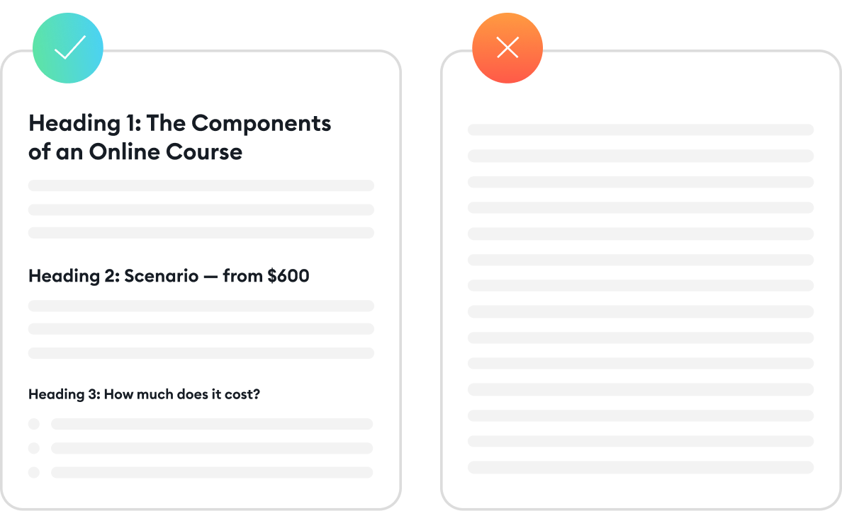
The structure of an article from the iSpring blog (left) and an article without headings. Which one would you prefer to read?
Headings are usually larger and bolder than the main body of a text. As for accessible text content, you can’t rely only on graphical identification of headings. Even if you make them big and use a different font, without the proper markup, screen readers won’t recognize them as headings and will read them as plain text.
If you create slide-based courses, make sure the headings are always formatted as such. You can also use the Accessibility checker, which is built into PowerPoint (File → Info → Check for Issues → Check Accessibility). If you create a webpage, use the H1 markup (followed by H2 and H3).
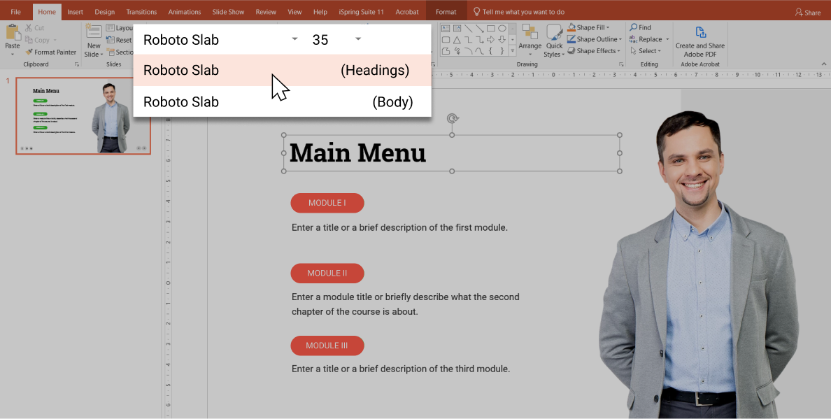
Always use a special markup for headings, since making a phrase large and bold doesn’t specify it as a heading for screen readers and search engines.
Also, keep in mind that long paragraphs are difficult to read. Try to break them into smaller parts using the concept of “one paragraph, one new idea.”
If there’s an enumeration of homogeneous sentence members, use bulleted or numbered lists. They’ll make the text look:
- Easy to read.
- Well structured.
- Less intimidating.
2. Be picky about fonts
Avoid font sizes that are too small, as well as those that are too large, since both options can make text difficult to read. While the former creates eyestrain, the latter makes users sit back and view it from a distance. The generally accepted size for the main body text is 16px.
Also, to avoid any confusion, it’s better to stick to only one or two fonts and try to use the most common fonts.
3. Use descriptive links
By descriptive links, we mean links that provide users with information about where the link leads or what will happen after they click. Compare:
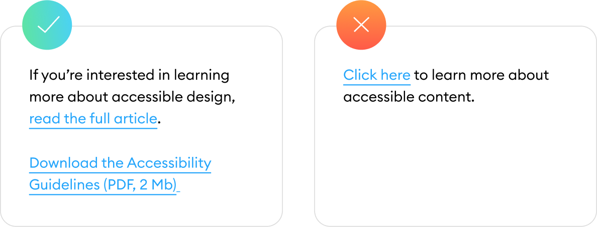
If clicking on a link downloads a file, always inform about its size and format.
Making your links descriptive is a good exercise in writing and style. “Click here” is a rather clumsy way to finish a sentence even for people with normal vision. For people who use screen readers and cannot quickly scan the entire page to get the context, it’s especially frustrating. Instead, if you just say, “Contact the support team,” you’ll make the text more readable and concise.
Colors and images
4. Avoid text in pictures (at all costs)
Using text as an image is a bad idea. Screen readers can’t recognize it as text to read it. When such an image is zoomed, its quality gets worse, and it’s hard to read since all you can see are pixels.
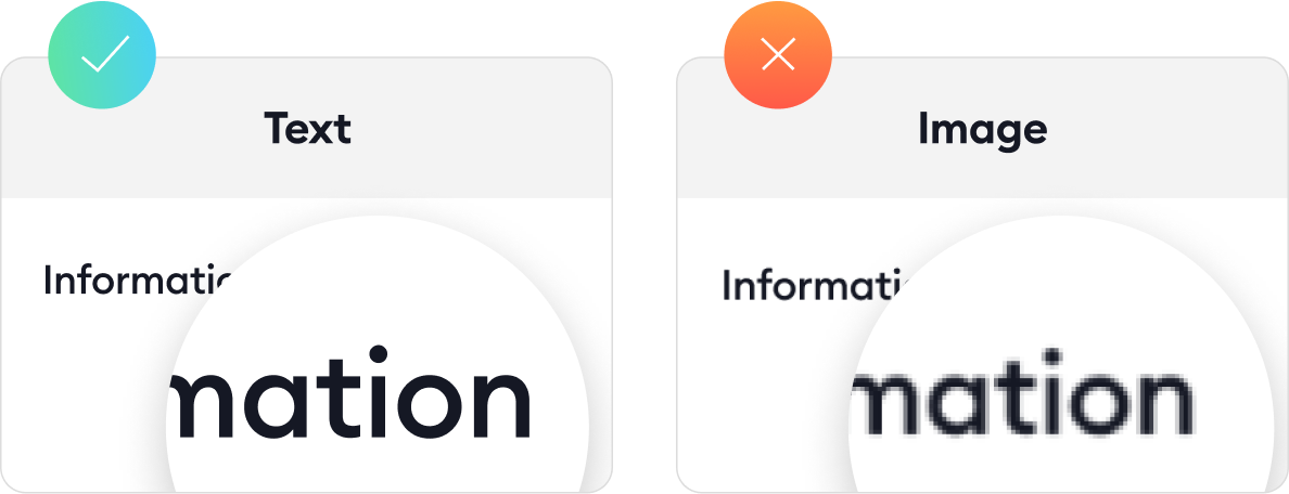
The word “Information” is pixelated after zooming in.
5. Add alt text for images
Alt text is a text alternative to an image. For example, if you have a bad Internet connection and an image doesn’t load, you’ll see a text description of the picture. Or if you use a screen reader device, it will read the alt text to provide context. Of course, this works only for cases when someone provides alt texts.
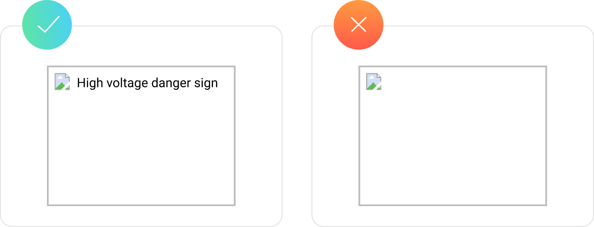
Alt text gives users enough context to understand the idea of an image, even when it’s not able to see it.
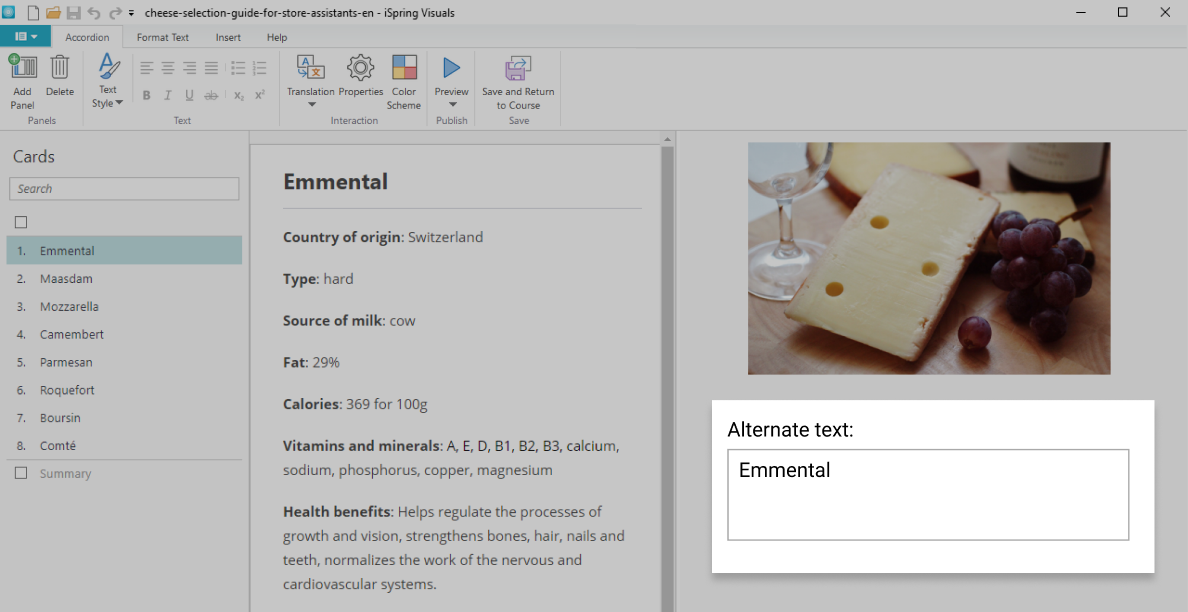
The alt text works just like captions for video; it describes what a user should be seeing. For instance, if you create a quiz or an interaction with iSpring Suite, it allows you to provide alternative text for images.
6. Don’t rely on colors alone
We often use a bright red color to draw attention to some elements or highlight mistakes when filling out forms. But there are about 300 million people with color blindness worldwide; for comparison, the population of the US was 327.2 million people in 2018. Therefore, colors should never be used as a single source of information.
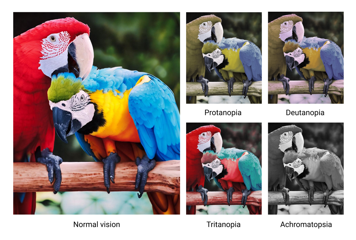
This is how people with different types of color blindness see the same photo.
Any meaningful element such as a button should be supplemented with a caption, so it will work regardless of what happens with colors.
7. Provide sufficient contrast
Information is easier to perceive when there is sufficient contrast between the text, graphic elements, and background. If the color of your text is too close to the color of the background, or you use a photo as the background, it makes the content difficult or impossible to understand.
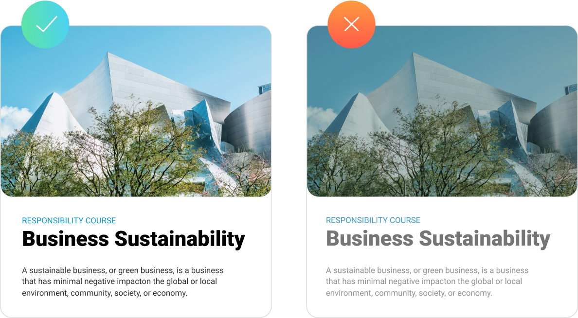
The low-contrast text (right) is harder to read, even for a person without any disabilities.
There are plenty of online tools, such as Accessible Colors, that allow you to readily check the contrast.
Also, some authoring tools allow you special accessibility modes. In iSpring Suite, for example, you can publish accessible quizzes by ticking a single checkbox. When a learner activates this mode, the quiz will transition into a simplified view that most screen readers can recognize with ease.

Standard mode vs. accessibility mode
Multimedia
8. Prepare captions and transcripts
Creating alternative ways to consume information provides equal access to content for learners with disabilities. Captions for video and transcripts of audio make content accessible for users with hearing or visual disabilities and provide a better experience for learners with different learning styles.
To lower the amount of manual work needed to prepare transcripts, you can try using different speech-to-text converters, and, as for captions, the easiest way to create them is by using YouTube.
9. Give learners the control
People with cognitive impairments often need more time to digest digital content, especially if they have memory problems. To help them access eLearning content and get the most from training, make the course navigation open to allow them to review what they’ve studied.
Also, it’s better to avoid time-limited activities and auto-advancing content when possible (although it is tempting to use these functionalities). The problem with auto-advancing content, such as animations and interactive elements, is that they can prevent learners from reading the entire text or studying the whole lesson.
If you believe that these elements are necessary, allow learners to take their time, take a step back to finish reading, and pause or skip the interaction.
Balancing Interactivity and Accessibility in eLearning
Accessible eLearning development often involves tradeoffs. Striking the right balance between immersive digital content and inclusivity is essential to provide equal learning opportunities for all. Here’s a recap of some common challenges and potential solutions:
- Multimedia elements. Audio and video content, as well as animations, enhance engagement but can create barriers for visually impaired learners or those with hearing disabilities. Solution: provide captions, transcripts, and audio descriptions to ensure accessibility of online learning materials.
- Navigation complexity. Interactive elements like drag-and-drop activities or non-linear navigation can be difficult for users who rely on screen readers. Solution: design intuitive, keyboard-accessible navigation and offer alternative interaction methods.
- Time constraints. Timed quizzes or fast-paced exercises might disadvantage learners with cognitive disabilities. Solution: allow adjustable time limits or offer untimed alternatives.
- Technology compatibility. Some eLearning tools and content formats may not fully support assistive technologies. Solution: use platforms that adhere to accessibility standards and test content with different assistive tools.
- Limited customization. Highly interactive content can lack flexibility for individual accessibility needs. Solution: provide adjustable settings, alternative content formats, and customization options to accommodate diverse learners.
Let us know if you’re using any of the tips described in the article, especially if you have your own golden rules for creating accessible content. We’d love to hear about your experience!


