How to Create an Interactive Map in PowerPoint [Template Inside]

Microsoft PowerPoint is truly a jack-of-all-trades. We’ve already shown you how to easily create flashcards, build Jeopardy games, design timelines, and even create quizzes there. In this guide, you’ll learn how to create interactive maps in a variety of ways without having to draw them from scratch.
What Is an Interactive Map?
An interactive map is a digital, clickable map that typically displays geographic information. Unlike traditional static maps that only display fixed information, an interactive map allows you to click, zoom, or hover to see more detail. This makes it a dynamic tool for PowerPoint presentations and online courses, providing a way to explore data and geographic locations in greater detail.
When Should You Use Interactive Maps?
As interactive maps serve multiple purposes, they can be incredibly useful in a variety of settings for both educators and business professionals. Here are some use cases for a map:
- Classes. Teachers can use interactive maps in geography lessons. By clicking on different countries or regions, students can learn some additional facts, such as capitals, economies, or traditional cultures. In history classes, a map can, for instance, be used to show the progress of battles waged during World War II or the migration patterns of ancient civilizations.
- Corporate presentations. Global organizations can show where their offices, factories, or customers are located. For example, managers can see how many employees work in different states or how customers are distributed by region.
- Marketing reports. Instead of presenting spreadsheets or static charts, market analysts can visualize market penetration, competitive presence, and average income by country or state, enabling more targeted, location-specific marketing strategies.
How to Create an Interactive World Map in PowerPoint
The first method of creating interactive maps doesn’t require any pre-downloaded map templates or images. Everything you need to have at your fingertips is PowerPoint itself. However, locating “Maps” might not be entirely intuitive. Follow these step-by-step instructions to create an interactive map in PowerPoint:
1. First, open your PowerPoint presentation and click on the slide where you want a world map to appear.
2. Click on the Insert tab and select Chart from the toolbar ribbon. This will open a dialog box with all of the types of charts you can add (this works properly in different PowerPoint versions, including PowerPoint 365, PowerPoint 2021, and PowerPoint 2019).

3. Select Map in the list of charts, and then click OK.

4. You’ll see a world map inserted into the slide and an Excel spreadsheet pop-up in which you can enter the data you need (e.g., countries, states, provinces) and the color saturation for each map object on a numerical scale. The higher the number, the more saturated the color.

As an example, let’s try to map the countries around the globe with the largest population in mid-2022 (from Statista). To do this, enter the countries’ names and their populations:

Note: By default, a PowerPoint map has 12 rows for adding locations in an Excel spreadsheet. If you need to display more geographic objects, you can easily expand this limit to the number of locations you need. Our table has 21 rows, so we need to expand to 21.
5. To do that, click on Select Data in the Design tab. In the opened window, expand the number of countries to the required ones in the line “=Sheet1!$A$1:$B$[your number]” and click on OK.

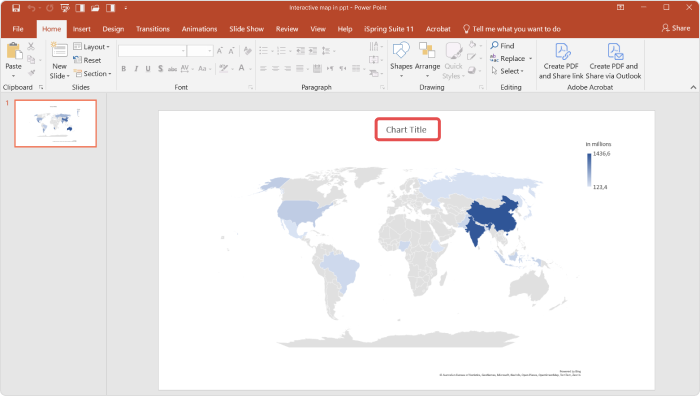
6. Perfect! All the countries are displayed on the map and colored according to their populations.

7. Now you can add a map title. Click on Chart Title above the map and enter its name:

Perfect! The interactive map is ready.
How to Make a Color-Coded US Map in PowerPoint
In PowerPoint, when you select Map from the Charts section, the default setting displays a world map. However, you have the flexibility to focus on a more specific region.
For example, if you want to create a color-coded U.S. map on, let’s say, the number of automobile registrations in different states, you can easily narrow your map down to just this one country:
1. To do that, once the world map is inserted into your slide, go ahead and delete any filled-in lines that appear by default in the Excel pop-up.
2. Type in the names of U.S. states along with the corresponding numerical data. As you begin to enter the names of the U.S. states, PowerPoint will recognize that your focus is on a single country and will automatically adjust to display a map solely of the United States.

3. Don’t forget to expand the number of rows to the number you need. We’re going to display 35 U.S. states, so we need to expand the number of rows to 36 (1 header row and 35 data rows). To do this, as we did in the previous example, click on Select Data, type “36,” and click on OK:

Fantastic! The color-coded U.S. map is ready:

How to Edit an Interactive Map
PowerPoint offers a range of customization options to tweak the appearance of your map, including changing the map layout and color palette. To do that, simply go to the Design tab on the PowerPoint ribbon and select the options you wish to modify:

By clicking on the “+” symbol located to the right of the map, you’ll reveal additional editing settings that enable you to display data directly on the map, add shadows, move the map legend, fill in the background, and more. For our example, we added some shadows and labeled the states to enhance the visual impact. Here’s the result:

How to Create an Interactive Map with PowerPoint and iSpring Suite
Sometimes you might need to add a map to your presentations very quickly and display a certain location in an interactive manner. Filling out Excel spreadsheets can take hours and is sometimes absolutely unnecessary. So, you may want to just insert the actual geographic map.
In this section, you’ll learn how to do that with a couple of clicks using iSpring Suite, the robust PowerPoint-based authoring tool:
1. To begin, download iSpring Suite. The software has a 14-day free trial, so you can explore its features without any commitment. Simply install it on your computer to get started.
2. Once the software is installed, the iSpring Suite tab automatically appears in the PowerPoint ribbon.
3. Select a PowerPoint presentation slide to which you want to add a map and click on the Web Object button in the Insert section. This option allows you to insert any web page, whether it is your website, an article, or a training manual published on the web. To display a geographic location, you can insert a Google Map.

4. Go to the Google Maps website and find a specific location you want to display on your map. Press the Share button → Embed a map → and click on Copy HTML.

5. Go back to your presentation. In the Insert Web Object window, select Embed code in the menu, insert the link, and click OK.

6. In the iSpring Suite tab, select Preview → Preview from This Slide to see the map.

Done! You’ve embedded the New York map in your presentation. Now you can zoom in, zoom out, and interact with the map to showcase specific boroughs and landmarks as needed.
How to Visually Enhance an Interactive Map
With iSpring Suite, you can not only embed a map, but also add different backgrounds to create a more immersive atmosphere.
1. To do that, click on Backgrounds in the Content Library section on the iSpring Suite tab. There you’ll find lots of locations, from devices to office settings and school environments.
2. In the opened window, select an appropriate background and click on Insert.

3. After you’ve inserted the background, right-click on it and click on Send to Back → Send Backward.
4. Adjust the size of your web object to the size of the whiteboard:

5. Perfect! Now it looks like an actual geography class. To add a personal touch, let’s insert a teacher. Click on Characters in the Content Library section and choose an appropriate one from thousands of real-life or illustrated characters:

6. Then press the Add to Slide button and click on Preview to see the final result.

Great! To publish the entire presentation, click on Publish in the iSpring Suite tab on the PowerPoint ribbon. If you want to publish your PowerPoint presentation online, select My Computer in the drop-down menu on the left pane. If you want to distribute your slides via an LMS as a SCORM file, click on LMS, then click on Publish.

An Alternative Way to Create Interactive Maps with iSpring Suite
In addition to inserting a real geographic map into your PowerPoint slide, iSpring Suite offers another possibility to create interactive maps with a Hotspot interaction. All you need to do is add an image to your PowerPoint slide and draw spots on it that will be highlighted when the mouse passes over them. You can add a description to each region and choose its shape and color.
This allows you to create a map of any location and add a description to provinces, landmarks, or important cities, as in this example of a map of the United Kingdom:

While we often associate interactive maps with geographic data, the term actually extends far beyond that. With iSpring Suite, you can make any static image dynamic.
For example, you could create anatomy diagrams to enhance medical or educational PowerPoint presentations about the human body. Alternatively, you might design a comprehensive infographic, wherein each point reveals additional facts when clicked. You could also display artwork, allowing viewers to explore different parts of a famous painting to learn more about the art, its history, or the techniques used. The possibilities are endless!
See how you can easily present the parts of an object, such as a vacuum cleaner:
Also read: How to Create a Hotspot Question for an Online Quiz
Template: Interactive Map in PowerPoint
If you don’t want to deal with Excel spreadsheets, multiple data entries, or downloading additional software, we’ve created an interactive world map template that you can easily customize for any purpose or situation. Just download it, place the pins where you want them, and your map is ready to go.
Download an Interactive Map Template →
FAQ on Interactive Maps in PowerPoint
1. What are the limitations of PPT when creating interactive maps?
First, PowerPoint doesn’t allow you to display multiple types of regions simultaneously. For example, you can’t showcase U.S. states and European countries on the same map. You must choose either countries or states or provinces. Attempting to mix different types of regions will result in an error message from PowerPoint.
It’s also not possible to add dots to represent cities automatically.
2. Do I need an internet connection to display an interactive map created with PowerPoint?
Yes. If your map relies on real-time data updates or external links, those specific features will require an internet connection to work properly. Additionally, if you’re using a feature that depends on Bing, Microsoft’s web search engine (via Insert → Charts → Map), then an Internet connection is also required to display the correct areas.
Alternatively, if you create a map with a hotspot interaction in iSpring Suite, it will be displayed perfectly even when offline.
To Sum Up
We hope you enjoyed this article and will explore one of the options mentioned above. If you find the methods for creating interactive maps using iSpring Suite compelling, go ahead and download the free 14-day trial to explore the tool’s capabilities firsthand.


