15 PowerPoint Tips to Make Your Slides More Effective

People often underestimate the power of a well-designed and effective PowerPoint presentation. Although everyone has heard the saying, “A picture is worth a thousand words,” in PPT land, the opposite seems to hold true.
As slides usually contain an overwhelming amount of text, which the presenter often reads out loud, PowerPoint’s reputation for being dusty and static is starting to make sense, isn’t it?
In truth, well-designed PowerPoint slides that balance text with other elements are much better at delivering the message to your audience.
We interviewed PPT expert Ferry Pereboom and compiled his insights into 15 PowerPoint tips and tricks to help you create engaging presentations. Here’s a quick rundown of the tips we’ll cover, which you can use as a checklist to ensure your presentations are on track once you have an idea of what they entail:
| Tip | |
|---|---|
| Texts | |
| Design | Select relevant, adequate visuals. Use mock-ups instead of screenshots and diagrams. |
| Navigability | Minimize the variety of transitions. |
| Hardware |
Now, let’s explore these tips in more detail.
Texts
The text should only complement your speech and emphasize its key points. After all, overfilling your PPT presentation with text can only result in two things:
- Presenters will read everything in the slides, creating a snoozefest for the attendees.
- Attendees will read the text on the screen instead of listening to you.
Remember, PowerPoint presentations should be, above all things, a visual aid. So, cramming a truckload of information into your slide shows makes no sense. That makes it especially important to focus on the content of the text.
With that in mind, here are some best practices for adding high-quality text to your PPTs.
1. Keep it short and to the point
As previously stated, it’s important to remember that a PowerPoint presentation should complement your speech. Avoid putting the entire text on the slides, as your audience prefers listening rather than reading what you intend to say.
Whether you use complimentary texts or bullet points, make sure to keep them short and sweet. For reference, you can follow the 5×5 rule: have up to 5 text lines on each slide, each with no more than 5 words per line.
That way, your audience will direct their attention to you instead of the screen.
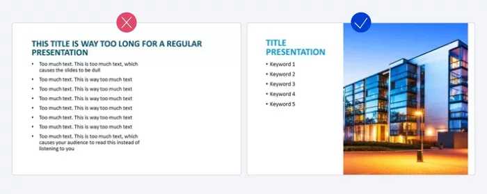
Pro tip: Optimize white space (i.e., space devoid of color, text, and other elements). Using it correctly helps to direct the viewer’s focus.
You can freshen up your slides by adding extra margins, dividing long paragraphs, and generally trying to use no more than half of the slide to place objects.
2. Choose the appropriate font
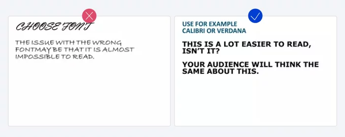
Opt for a classic font over a creative one. The wrong choice can make your text unreadable to your audience. Plus, if the computer lacks the font you used, PPT will replace it with a random one.
Sans serif fonts like Verdana, Calibri, and Helvetica are all safe options. These fonts are widely used and available on all computers.
3. Enhance readability with the proper font size
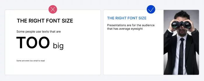
For more effective PowerPoint presentations, highlight key text and facts with bigger, bolder, and brighter formatting. Fonts can help with this as well.
That said, choosing the right font size can be challenging.
On the one hand, you want the audience to read the key points. And on the other hand, you don’t want your text to dominate the space, as you’d probably like to add engaging visuals to your PPT slides as well.
Here are our recommendations for sizes you can use to create good PowerPoint presentations:
- Headers should be a minimum of 20pt.
- Body text can be 18pt.
These sizes will provide learners with a comfortable viewing experience and ensure legibility across various devices, including laptops, computers, tablets, TVs, and large screens.
Pro tip: Use the Slide Master feature to organize headings and subheadings on your slides. You can also use it to customize color schemes and add logos to maintain a consistent and unified appearance across multiple slides.

Design
Simple yet brilliant design can enhance your message and facilitate communication. When crafting your slides, try to find balance and remember that less is more.
It’s always better to use a maximum of 3 or 4 colors that you know will combine well instead of an entire palette and align objects to create symmetry.
Here are some additional PowerPoint design tips to help you create a good presentation.
4. Increase contrast
Besides the look and size of your font, consider contrast to facilitate reading. Using dark text on a light background or vice versa is a standard practice. But if you’re using text in a photo, things can get a bit trickier.
To enhance the readability of text in images, consider adding a border or shadow around the text. Alternatively, you can place the text within one of the PPT shapes.

5. Use coloring wisely
Colors help add visual interest and direct attention to slides. That said, we recommend keeping your audience in mind and defining the purpose of the speech before selecting colors.
For example, using vibrant colors is an excellent idea for presentations in primary schools. However, when preparing a speech for business professionals in a formal setting, it’s best to tailor your color choices to your audience’s expectations.

6. Use PowerPoint shapes
PPT provides users with a great deal of shape options beyond the standard rectangle, rounded rectangle, and oval patterns. Besides using shapes to create diagrams and flowcharts quickly, you can use them to express your message more clearly or replace bullet points, for example.
Moreover, you can create custom PPT shapes to fit your specific needs. For instance, you can reshape arrows to fit the dimensions you like or create something unique by editing the shape’s points. After that, you can merge or split shapes, cut out the overlapping parts, and more.
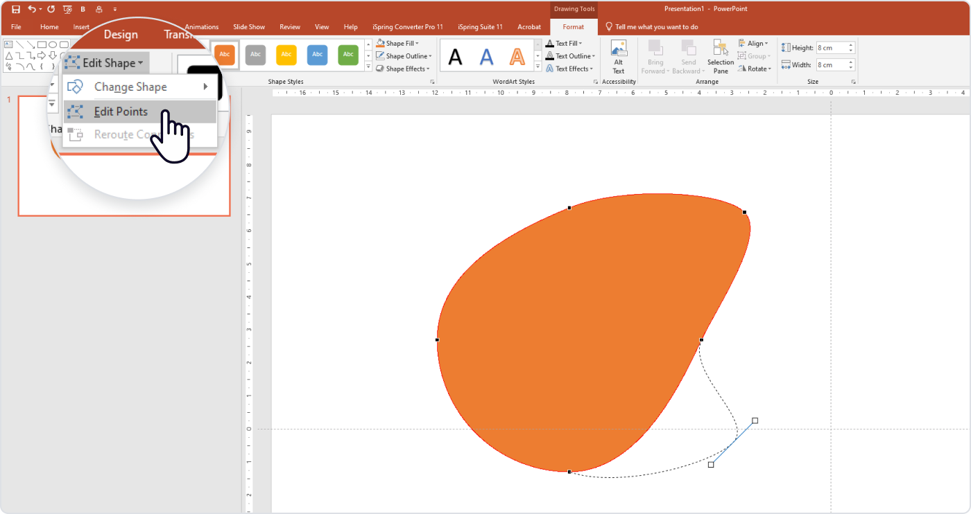
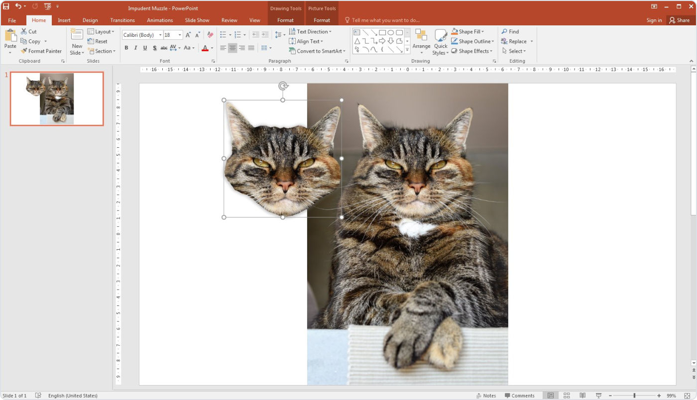
Lastly, you can crop images into custom shapes.
7. Select relevant, adequate visuals
There isn’t only one way to add imagery to your PowerPoint presentations. That said, you should consider the context to ensure the images you choose are adequate for the audience.
For instance, you can use memes and jokes to break the ice or explain your ideas to people when participating in a less formal event. But we don’t recommend adding jokes to a presentation on financial year results.
Beyond that, stay consistent. Using different image styles throughout the same presentation can be distracting to your audience, and the same applies to images of varying quality.
Always opt for high-quality images that support your message to create a solid presentation.

You can also try inserting GIFs into your PPT slides. GIFs are looped animated images used to share a mood, idea, or anything else. They are often used to quickly demonstrate a process or add a joke. But be careful — they may be inappropriate in some cases.
8. Use mock-ups instead of screenshots and diagrams
Diagrams, schemes, and screenshots usually don’t help your presentation. Although this information may be important to your story, sometimes it can misdirect your audience’s attention.
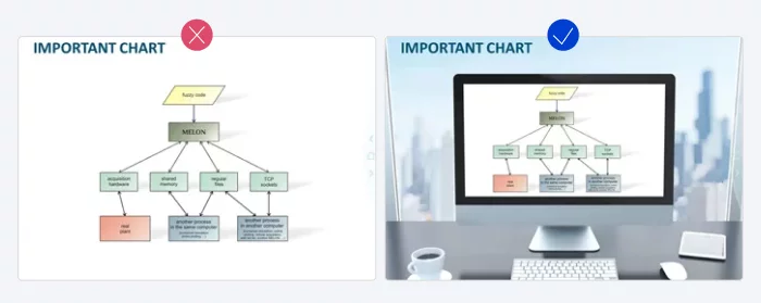
To turn the slides into a good PPT presentation, consider combining diagrams, schemes, or screenshots with device mock-ups, such as an image of an iPad, laptop, digital projector, or computer.
In the example below, you can see that the image is much more impactful when you add a mock-up.
9. Present data visually as much as possible
If your presentation contains a lot of data, use visual aids to support the text and convey some ideas more clearly.
Using graphs may be a good way to achieve your desired results. For instance, PowerPoint provides a wide range of ‘doughnut’ charts, which are perfect for making comparisons.
Here’s an example of how illustrating data with a doughnut graph can make it easier to digest.

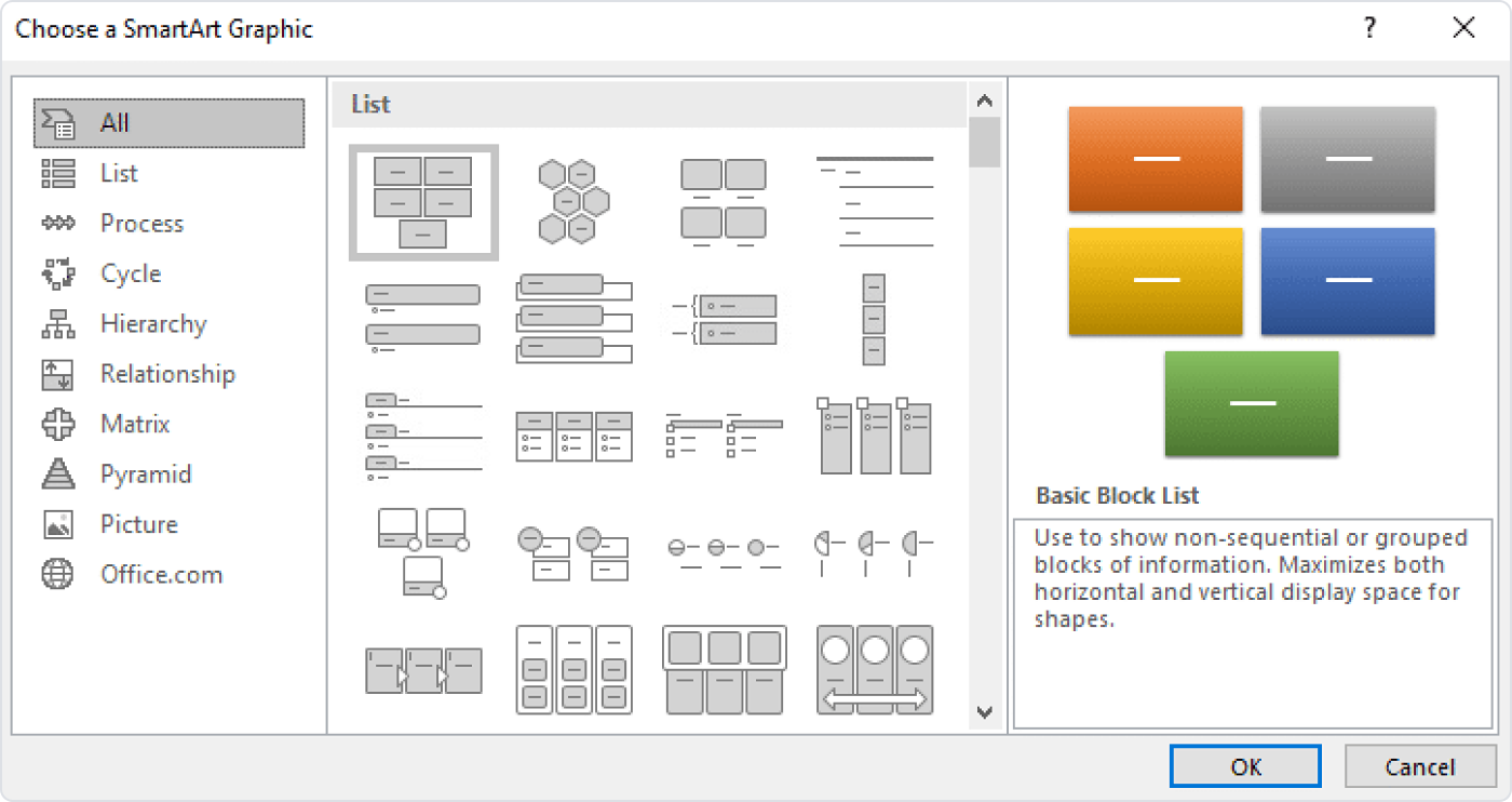
You can also use SmartArt, a built-in tool that lets you create infographics in the PPT app. SmartArt includes a wide variety of templates, such as cycles, hierarchies, relationships, and pyramids. For example, you can use SmartArt to replace simple bullet points with more visually appealing elements.
10. Simplify your tables as much as possible
Tables typically contain a lot of information and numbers, making slides look crowded and chaotic. In this case, simplify the tables as much as possible.
Delete unnecessary outlines, colors, and borders. Again, “keep it simple” and “less is more” are the keys to designing clear tables.
11. Use industry-specific PowerPoint templates
Industry-specific PPT layouts help immerse the audience in the subject and make the information more relatable to a specific audience.
Pre-made, industry-specific layouts can help you:
- Save time by using relevant PowerPoint templates.
- Gain inspiration and find design tips for your specific topic.
- Repurpose the slides into social media posts.
Start your search with templates right in the PPT app. You can find them by clicking on File → New. Use the search function to find relevant industry designs.
Then you can explore more options in Slidesgo or SlidesCarnival to find an ideal fit for your topic.
Navigability
Navigability signifies how you present the slides to the audience and control the playback. You need to plan this out well to ensure that the transitions, notes, animations, and other elements in your presentation result in an effective slide show that doesn’t waste the audience’s time, generating frustration.
Here are a few essential PowerPoint hacks to make your presentation easy to navigate.
12. Minimize the variety of transitions in your PowerPoint presentation
After they finish creating a slide show, people sometimes find the final presentation boring or static. So, they start to use (or even overuse) transitions to “breathe life” into the presentation.
We don’t recommend this approach. While PPT offers a wide range of transitions, users find their excessive use distracting and unsophisticated. A simple “fade” effect between slides is more than effective and, more importantly, sufficient.
13. Rely on PowerPoint’s Presenter View
Presenter View is a valuable tool for delivering presentations to your audience. With this functionality, you don’t have to remember everything or doubt your presentation skills.
When presenting to the audience with Presenter View enabled, you can see what’s next, keep track of the time, use a laser pointer and/or pen, and access your speaker notes.
You can also paste your script or lecture notes here to avoid making your slides text-heavy.
14. Provide an outline of the presentation
Starting your presentation with an outline sets the tone, especially for longer speeches or when presenting with someone else. To provide an outline, include at least these three types of slides:
- Welcome slide. Presenters typically place the title and description of the presentation and their credentials here.
- Menu slide. You can place the contents of your presentation here to jump to the needed part quickly when required (e.g., to refer to a particular idea during a Q&A session).
- Summary slide. This will summarize the ideas you’ve presented and help you when you’re wrapping up your presentation.
Here are a few more effective tips to structure your presentation — check them out.
Hardware
Your settings can be altered when using other operating systems and even different PPT versions. To avoid this, take your own laptop when you’re presenting. But what if you can’t take your laptop with you?
15. Back up your presentation
It’s always a good idea to copy your PPT and save it as a PDF file, just in case. That way, if the computer you’re given doesn’t have PPT installed, you’ll have an alternative format available.
With PDF, you’ll never run into compatibility problems. The only limitation is that your animations, GIFs, and transitions won’t perform.
However, there is another backup hack. You can upload your PPT presentation into Google Slides, which is a cloud-based app that works the same way on all operating systems and devices.
To access your files, you will need a browser and an internet connection. This solution will work best for your primary backup.
Unlock Learner Engagement with iSpring
In recent years, PPT presentations have surpassed classrooms and conference rooms, becoming valuable resources for various audiences. Now, they aren’t just slides — they are informational products that people download, study, and share. That’s why PPT techniques on how to make good slides remain as relevant as ever.
If you rely heavily on PPT for your work, improve it with iSpring Suite — an authoring toolkit that’s seamlessly integrated into Microsoft PowerPoint.
With iSpring Suite, you can replace multiple design tools and PowerPoint add-ins in one go. It offers hundreds of design templates, color schemes, and visual elements, allowing you to create engaging PowerPoint presentations that captivate your audience and keep their attention.
Plus, its Content Library provides access to over 89,000 slide templates, backgrounds, and characters.
Besides the pre-designed characters, iSpring Suite empowers you to create your own. Customize hairstyles, select accessories, and choose clothing that aligns with your brand or story and resonates with your learners.
Since you already know how to use PPT, mastering iSpring Suite to craft a great presentation or a full-fledged online course won’t take much time at all. You can populate it with quizzes, interactions, web objects, high-quality audio narrations, and videos easily — with no technical knowledge required.
Also read → How to Convert PowerPoint to MP4 Video on Windows & macOS
iSpring Suite also lets you convert your slides into HTML5 format, enabling your audience to view them online instantly, directly in their browsers, without downloading. Moreover, you can effortlessly share your presentation as a YouTube video with a single click.
Try iSpring Suite for free and create a stellar presentation now!
FAQ on How to Make an Effective PPT Presentation
People often search for ready-made PowerPoint templates and PPT tips online. Here are some we’ve found for your quick reference. Feel free to use these rules with our proven PowerPoint hacks.
What is the 5–5–5 rule in PowerPoint presentations?
The 5-5-5 rule prescribes that you should limit slides to 5 lines with 5 words each and use this format for a maximum of 5 consecutive slides. This encourages creators to be concise and deliberate in their design.
What is the 5–second rule in PowerPoint?
The five-second rule says that viewers should grasp a slide’s idea within 5 seconds. You can achieve this with concise text and compelling design.
What is the 10-20-30 rule in a presentation?
This rule advocates concise PPT presentations: 10 slides, 20 minutes, with a font size of 30 points. Guy Kawasaki, a Silicon Valley venture capitalist, formulated the 10-20-30 rule after watching numerous exhausting pitches. Learn more about the rule on Kawasaki’s website.
What PowerPoint hacks are you familiar with? Share your favorite ones with us! We’d love to hear from you in the comment section.
About the author
Ferry Pereboom co-founded PPT Solutions, a prominent design agency in the Netherlands.
The company creates eye-catching PowerPoint presentations. PPT Solutions serves around 1,500 clients worldwide, with a team of 28 PowerPoint specialists, delivering services to customers across twelve countries. Ferry’s primary role is to help new and existing clients overcome presentation challenges.
Feel free to visit www.pptsolutions.nl for more PowerPoint tips and tricks.
